Showing posts with label Coca-Cola. Show all posts

Thursday, April 21, 2016

Coca-Cola "One Brand" Approach Likely To Fail

Facing declining soda category trends in the United States and flat category growth globally, Coca-Cola is launching a new go-to-market strategy aimed at securing its market share and growth prospects.

The heart of this new strategy is unifying Coke, Diet Coke, Coke Zero, and Coca-Cola Life under a "one brand" marketing brand campaign and packaging architecture design. Historically, the company has treated the variants more as individual brands. The new design will be rolled out in Mexico first this May, with other markets adopting the new packaging throughout 2016 and 2017, with the US likely at the tail end of the transformation.

The marketing campaign will be based on the "Taste the Feeling" concept and supported by 10 TV ads, digital, print, out-of-home, and point of sale materials. The objective of this effort is to have all variants of Coca-Cola will be unified under this message and speak together as one voice instead of separate marketing for Coke, Diet Coke, Coke Zero, and Coca-Cola Life.

The packaging design is also aimed at driving a greater sense of brand unity and halo across the business.  All of the Coke variants will now all display the signature Red Disc, although the different variants will still feature a splash of their own unique colors: black for Coke Zero, silver for Coca-Cola Light/Diet Coke and green for Coca-Cola Life.  Marcos de Quinto, Coca-Cola CMO explained this decision by saying "Packaging is our most visible and valuable asset, . . .The Coca-Cola Red Disc has become a signature element of the brand, synonymous with great taste, uplift and refreshment. By applying it to our packaging in such a bold way, we are taking the next step towards full adoption of the 'One Brand' strategy, uniting the Coca-Cola family under one visual identity and making it even easier for consumers to choose their Coca-Cola with or without calories, with or without caffeine."  Although the company admitted it is still working to determine the exact packaging execution of this vision in the US where Diet Coke has a large market share and utilizes "Coke" on its packaging vs. the other variants, which use the more formal "Coca-Cola".


My take on this brand strategy approach is simple - it's a mistake and will likely fail.

The objective of this strategy is to clearly drive greater scale, which from a marketing standpoint traditionally means driving greater efficiency in advertising spending (e.g., getting a bigger bang for your buck because any advertisement should now drive sales across the broader brand portfolio vs. just one Coke variant like the historic marketing was targeted).  Accepting this premise would obviously seem very financially attractive as it would allow Coke to reduce its overall marketing budget because it no longer needs to run four independent advertisements to support the four different variants, it can now look to drive all four behind one advertisement.  However, I would argue that any shorter-term cost savings will be more than offset by longer-term revenue declines because the effectiveness of the 'one brand' advertisement will likely be lower than Coke's historic variant focused approach.  This is the case because to make this strategy work, Coke effectively needs to dilute its messaging to the least common denominator that halos across all four variants.  What made Diet Coke and Coke Zero so powerful is they each spoke to two very different target consumers than original Coke and I worry that one advertising campaign will soften the brand's ability to both target and resonate as deeply with each individual target, instead opting for being a bit of everything for everybody.

From a packaging standpoint, the company is also clearly trying to make a scale play by increasing the visual brand block at shelf with a sea of red.  This in theory should grab more consumer attention in store.  Additionally, for a design purist standpoint, the simplicity of the new brand architecture is far more beautiful than the current disaggregated design.  However, sometimes the uglier solution is the more effective solution from a consumer standpoint.  What consumer has ever complained they cannot find Coke on the shelf?  I have real worries that the new packaging will lead to significant confusion at the shelf and in some cases will lead to the consumer either walking away empty handed or with the wrong item.  Simply put the packaging is just too similar across variants to allow the consumer to quickly find their variant of choice - especially in a category dominated by a grab and go mentality.  Additionally, from an on-pack communication standpoint, the variant name is in the wrong location on the can and bottle.  It should be below the brand name where consumers eyes are trained to expect it, as opposed to up top.  The location on the top of the label is likely to be missed by many consumers based on the fact that the packaging pulls their eye directly to the brand logo and consumers are trained to read down, and not glance back up.  Finally, I'd argue consumers have a strong affinity for the can color of their personal favorite variant.  In many ways, what can color can you prefer has come to express something about your personality to yourself and others in our society - not necessarily good or bad - but something about who you are.  I'm a black can (Coke Zero) guy.  I don't think consumers will ever articulate this, but I expect the black can people and the silver can  (Diet Coke) people to have some hesitations about picking up a new red disc can.  I think they'll miss how their old can helped expression a very small piece of their personality.  In this way, Coke will be a victim of its own historic success.

Saturday, January 3, 2015

Bud Light Recycles Coke's Label Campaign

A few years ago, Coke launched its "Share a Coke" campaign first overseas and then in the US over the past summer where the brand put the 250 most popular American teen names and other millennial sayings on its labels.

Now it looks like Bud Light is taking a page out of Coca-Cola's playbook.  As part of its "Perfect Beer For Whatever Happens", Bud Light is launching new bottle labels featuring over 100 different varying messages.

Bud Light Up for Whatever Bottle

Each label touts Bud Light is the "perfect beer for ... ". 

For example:
  • "the perfect beer for when you're eating breakfast meats outside of breakfast hours"
  • "the perfect beer for forming a one-person conga line"
  • "the perfect beer for leaving your comfort zone in another time zone"
  • "the perfect beer for taking off the blindfold and showing that piƱata who's boss"
  • "the perfect beer for tuning up the old air guitar"

The messages are suppose to help position the brand around inspiring spontaneous fun. And while the messages are fun enough, they do not have the same compelling call to purchase as consumers seeing their names on a bottle or labels such as "BFF,” “Star,” “Bestie,” “Legend,” “Grillmaster,” “Buddy” and “Wingman” like Coke featured. 

Additionally, the messaging in at least one of the accompany TV advertisements fails to hit home on this core benefit because it over complicates its message by trying to communicate too many things...


The area of the campaign that has the most promise is where the brand will customize beer bottle labels sold at sporting events and concerts that allow some drinkers the chance to win random, on-the-spot prizes, such as backstage passes or other real-time rewards.

Using the beer labels as a ticket for entry into a contest or a treasure hunt is clever and I believe will be compelling enough to drive consumers at the events to purchase.  The biggest question is how much scale can Bud Light generate with event based programs and will it be enough to generate sufficient social buzz to drive a noticeable lift in sales?  The other question is why didn't the brand aim bigger?  It seems like the brand could replicate this strategy on a much large scale with a McDonald's like Monopoly game where the notion of spontaneous fun can support itself organically.

Saturday, March 23, 2013

Rating Pepsi's New Bottle Design

Pepsi recently announced plans to launch new bottle shape for the first time in 16 years, with the new bottle starting to ship as early as next month.

The bottles will feature a swirled grip on the bottom portion of the bottle, a shorter label edged in a "cola-colored" border, as well as, a larger version of the brand logo. A spokesperson for Pepsi explains some added features of the design and how they fit with the equity: "It's not uniform, it's a little asymmetrical, there's a little edginess and playfulness, which is consistent with Pepsi's equities and youthful spirit."


Take a look...
I'm a fan of the new bottle for three reasons:
  • The new bottle is more unique.  It's takes on a distinctly more masculine shape (e.g., broad shoulders, narrower waist) than the old bottle, which is also a sharper contrast to Coca-Cola's more classical feminine "contour-design" or "hobble skirt" bottle shape
  • The new bottle design, higher label placement, larger logo, location of brand name do a much better job drawing your eye to the logo and brand name, quickening/improving brand recognition and brand building
  • There's no doubt this new bottle design offers significant cost savings for Pepsi and lowers the environmental footprint. Part of this comes from the smaller label size and smaller cap size, but I also suspect the new bottle design requires less plastic as well - I just hope the structural integrity of the bottle is stronger than most environmentally-friendly plastic water bottles.
Do I think the new bottle will ever challenge to be on par with the classic, iconic Coke bottle?  No, definitely not.  But it does appear to be a solid effort to modernize the Pepsi bottle, while reducing costs and the environmental footprint.

Tuesday, January 15, 2013

Coke's 'Coming Together' Obesity TV Ad

Coca-Cola just launched a new tv campaign entitled 'Coming Together' that seeks to address concerns about soda's role in the nation's obesity problem.  The campaign is supported by a 2 minute tv ad...


It's an interesting advertisement in that it pushes consumers to consider better for solutions versus full calorie sodas without fully condemning Coca-Cola, and in fact praises how proactive the company has been about delivering better for you alternatives.  It's done in a smart way as to be honest about the connection of full calorie soda consumption with weight gain, but also actual has an strong underline sales message about many other products in Coke's product portfolio such as Dasani, Vitamin Water, Coke Zero, Diet Coke, and juices.  In reality, the tv commercial is not really an admission of fault, but rather a scale advertisement for all of Coke's better for you products. 

Is it dishonest to be selling products while trying to look like their doing the right thing?  No, I think its a smart business approach.  Granted, I think health nuts (and many non-health nuts) would argue that the artificial sweeteners in many of their no or low calorie beverages are actually worse for you than the full calorie alternatives.

Wednesday, August 8, 2012

Who are the Olympic Advertisers and Sponsors again?

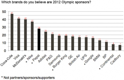
A new consumer study completed by Toluna Global Omnibus illustrates that consumer awareness and recall of what companies are Olympic sponsors and advertisers is surprisingly low.  The graph below illustrates the brand recall by company (unclear if this is aided or unaided awareness):

There are two notable take-aways from the data above.

  1. 5 of the top 16 companies (including 2 of the top 5) got credit for being a sponsor without actually spending a dime on Olympic advertising
  2. Even Coca-Cola, the brand with the most recall, has shockingly low awareness of sponsorship, with less than 50% of consumers aware of the linkage to the Olympics, and 28% of consumers crediting their ads back to primary rival Pepsi
These data points bring two thoughts to mind, first the investment in sponsorship doesn't seem to equate to a considerable amount of revenue upside.  Second, brands are really doing a bad job of differentiating their advertisements and breaking through to drive recall.  

I posted a few days ago about how many Olympic ads all seem to blend together, so check that post out if you haven't and watch the three example ads in that post.